Design system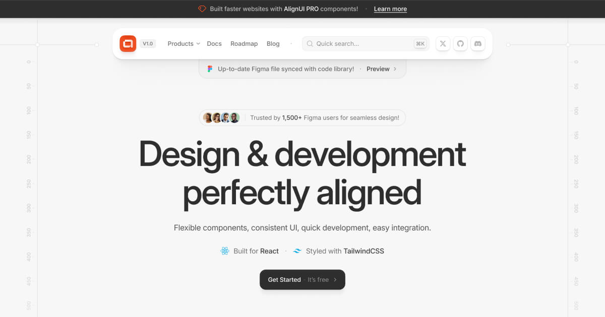
 AlignUI
A Figma-matched React system aimed at dashboards and polished product interfaces.
UI libraries / 21 resources
Compare the trade-offs between styled systems, unstyled primitives, React components, and ready-made page sections.
Open an entry for compatibility, pricing, license, and the original source.
A Figma-matched React system aimed at dashboards and polished product interfaces.
Unstyled, accessible React primitives for building a custom design system.
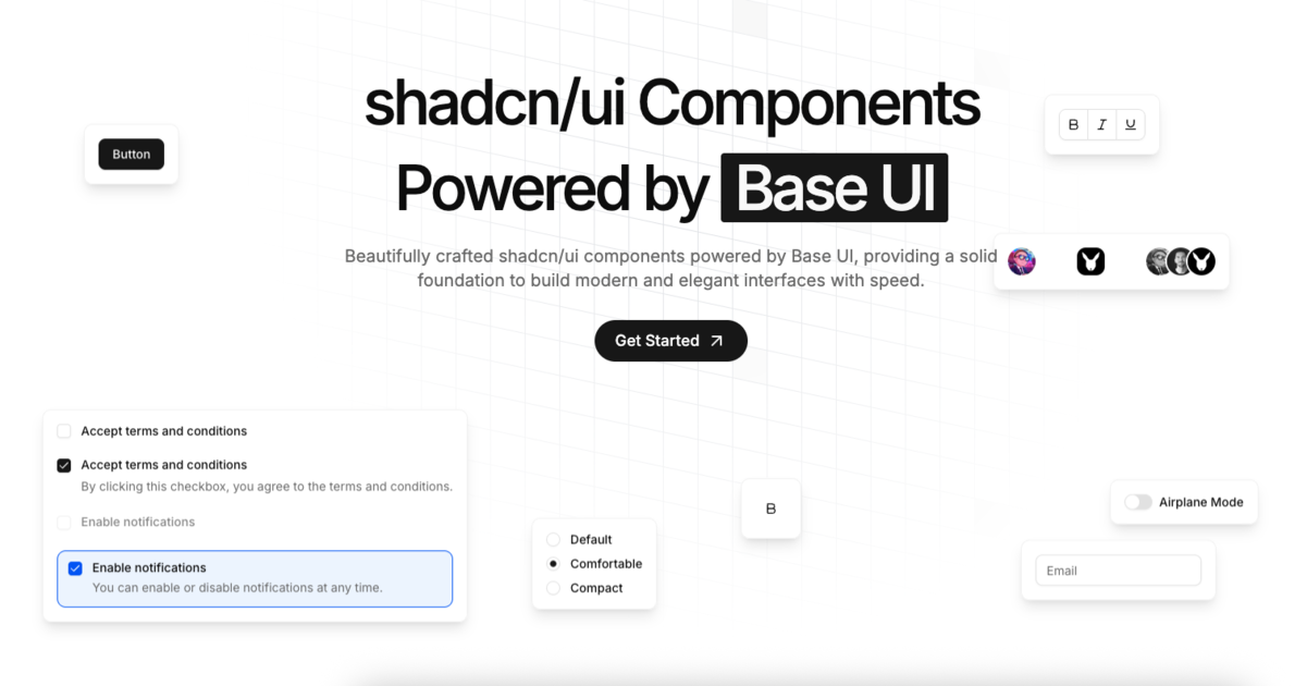
shadcn-style components rebuilt on top of Base UI primitives.
A compact catalogue of categorized shadcn/ui blocks for React products.

A modern component set built on Base UI with an expanding agent-friendly layer.
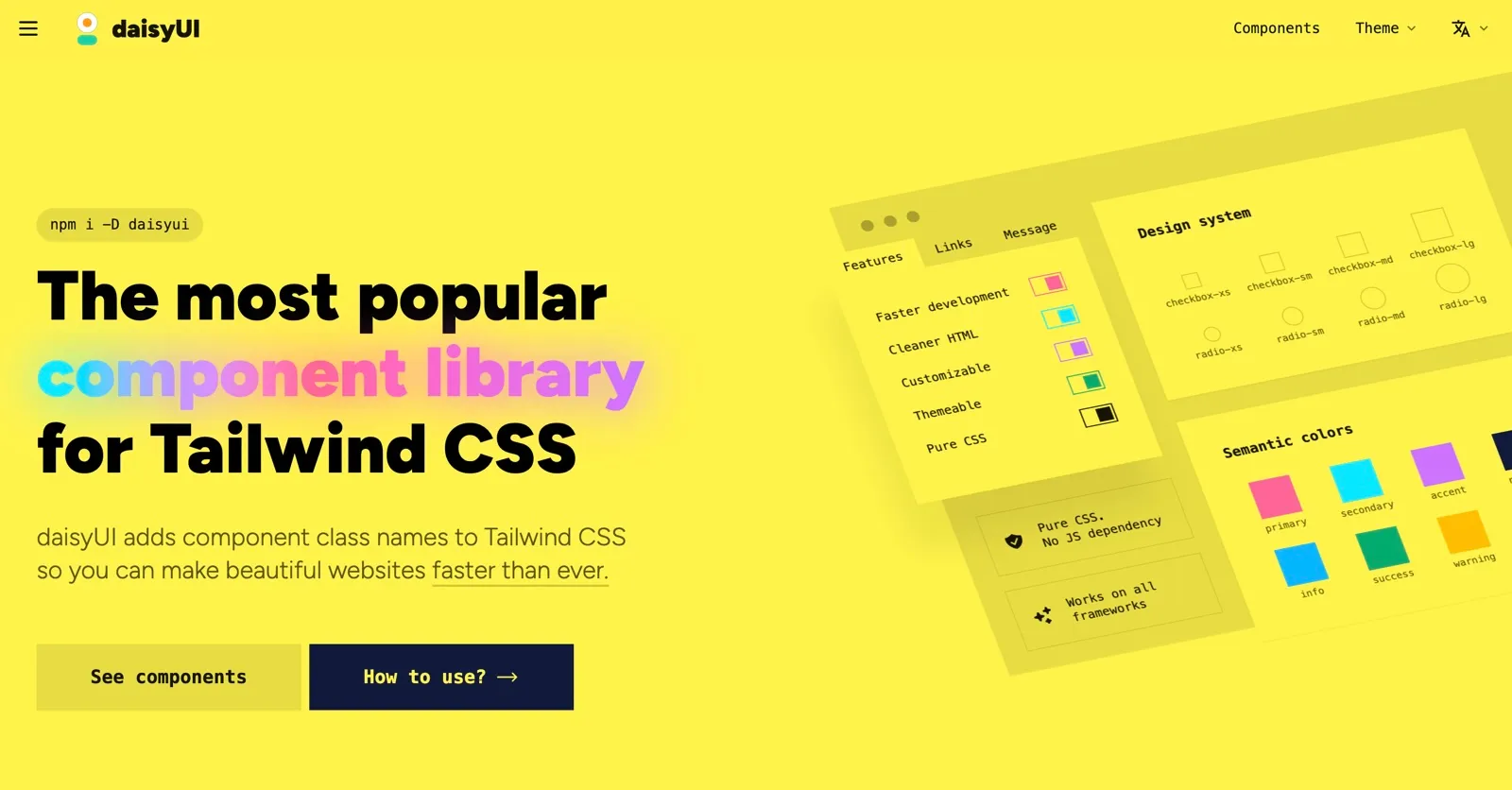
Class-based Tailwind components with themes and no JavaScript dependency.
Framework-friendly Tailwind components, blocks, and templates.

React components plus MCP tooling for component discovery, rendering, and design-system governance.
Polished React components with automatic theming and customizable defaults.

Advanced shadcn/ui components for pickers, uploaders, editors, and product workflows.
Animated sections, effects, and micro-interactions built for React and Tailwind projects.
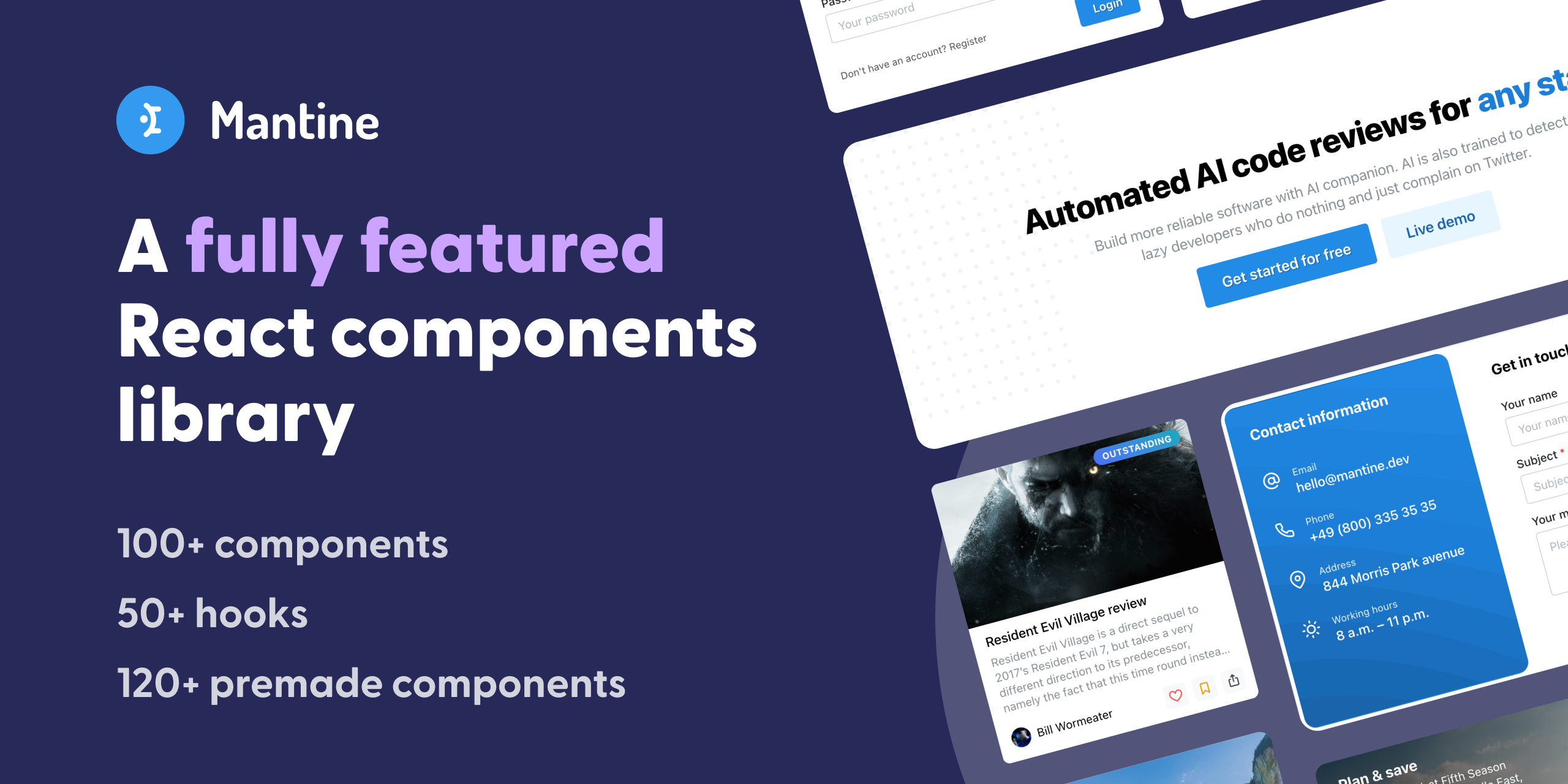
An all-in-one React library with components, forms, hooks, and theming.
A mature React implementation of Material Design for data-heavy applications.

Hooks and components for building custom React interfaces with consistent interaction behavior.
Composable React components with source code you can customize inside your project.
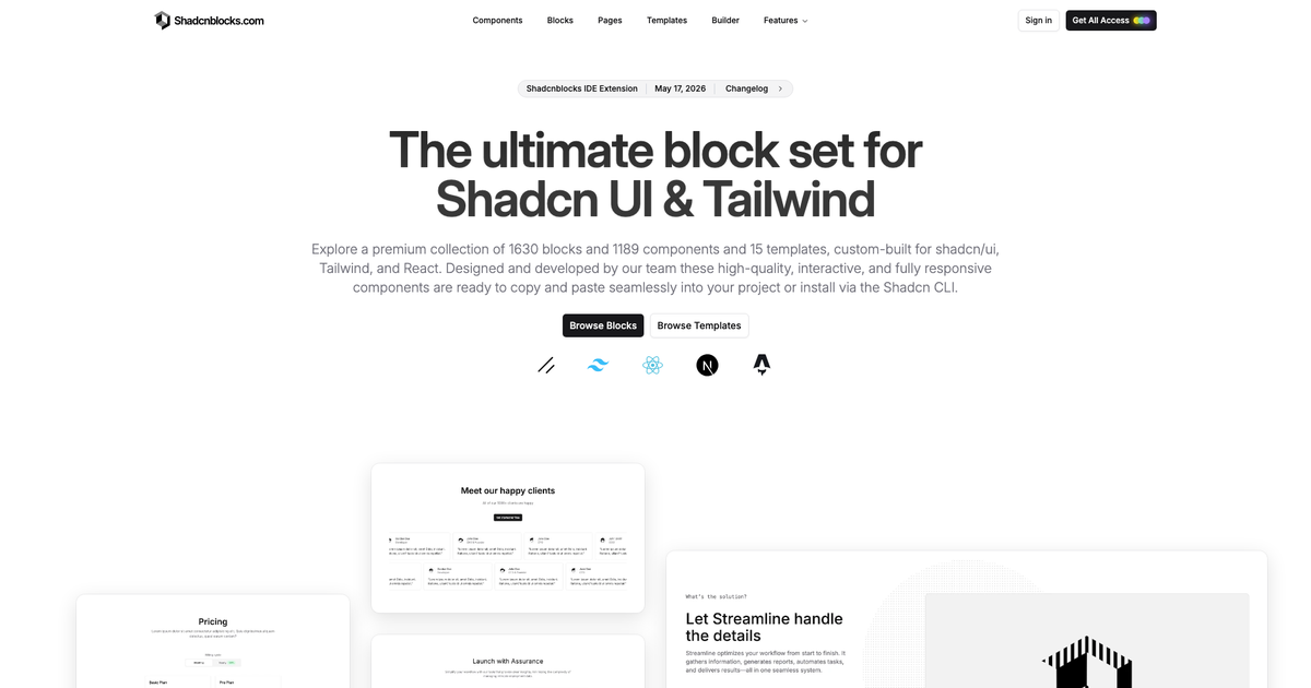
Pre-built shadcn/ui sections for composing landing pages and product screens.
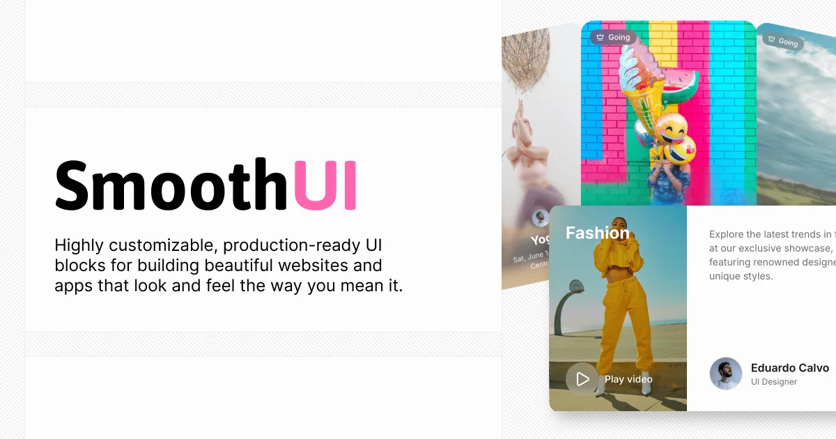
Animated React components for richer scroll, transition, and interaction work.
Conversion-focused Tailwind sections for modern marketing pages.
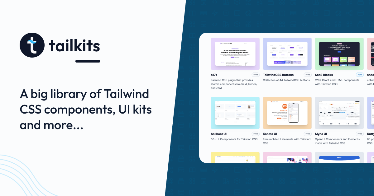
A directory for comparing Tailwind templates, components, tools, and kits.
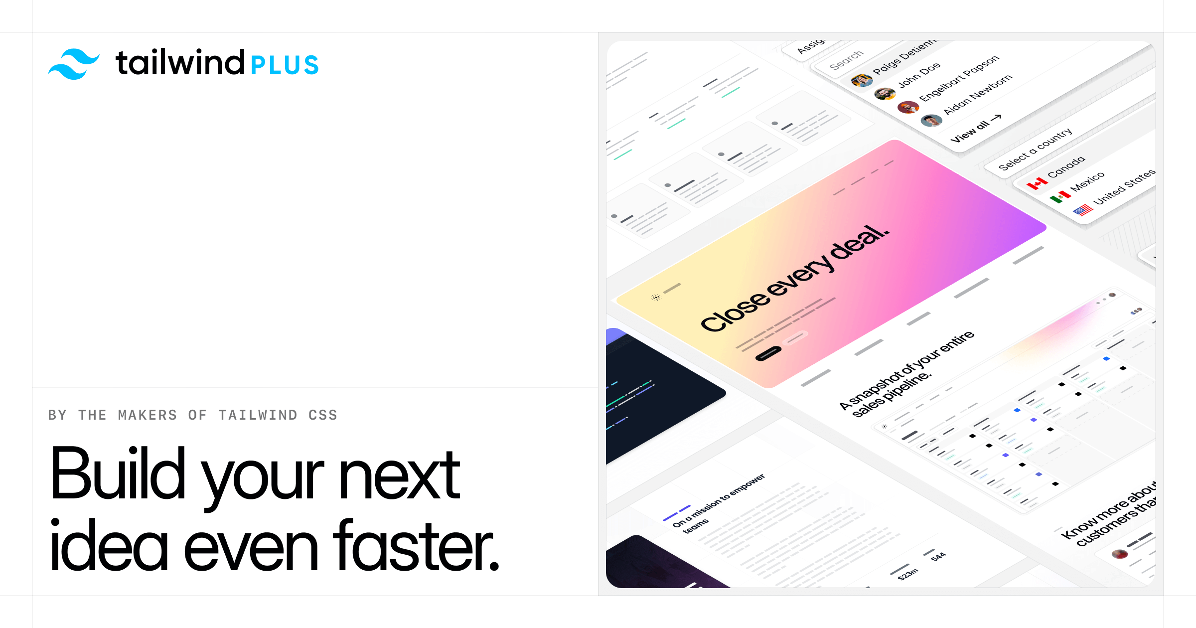
Production-ready components and templates from the Tailwind CSS team.
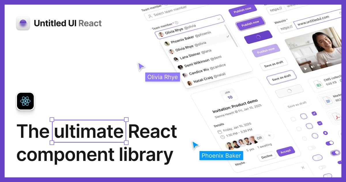
A large design system with React components, Figma files, page examples, and agent guidance.